
01
Audit Overview
Your store's untapped revenue potential — and how to unlock it
Why We Created This Audit
We analyzed hugbel.com the same way we've audited 350+ e-commerce stores — looking for the specific gaps between your current experience and what top-performing Home & Living stores deliver. Every finding in this report is a revenue opportunity backed by industry data and competitive benchmarks.
Critical
Important
Opportunities
 This audit was prepared by Growisto — a CRO-led Website development team behind 167% conversion growth for Atomberg, 46% CR lift for TyresNmore, and 350+ e-commerce projects.
03
UX & Conversion Findings
Page-by-page analysis with visual comparisons against top Home & Living stores
Email popup on cart loses 5-12% of checkout-intent buyers; exit-intent is the standard fix
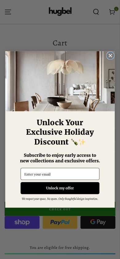
Hugbel cart — popup overlays the checkout area
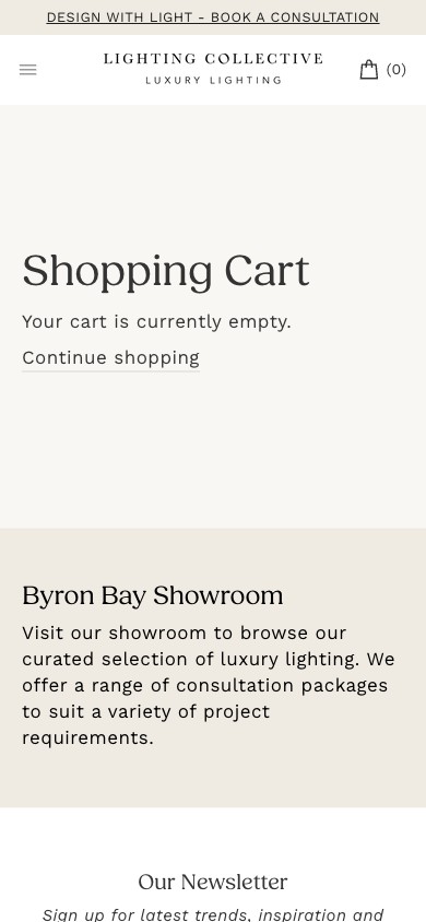
Lighting Collective cart — no popup at this stage
Observations
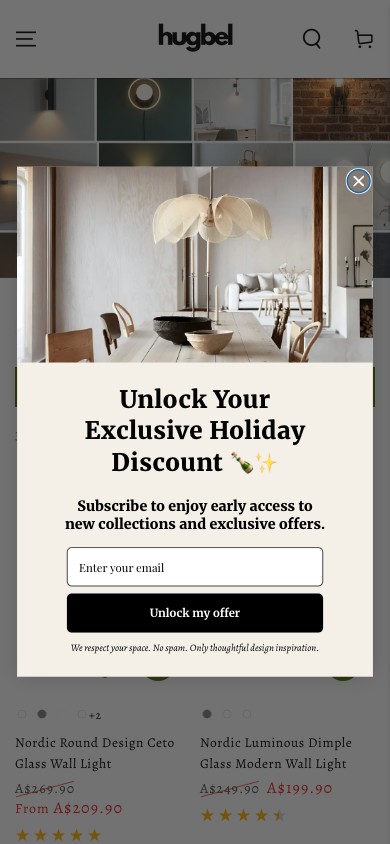
- The 'Unlock Your Exclusive Holiday Discount' popup we flagged on the PDP also fires on the CART page — directly over the Shop Pay / PayPal / Google Pay express checkout buttons and the CHECK OUT button.
- Cart-page traffic is the highest-intent traffic in the entire funnel. These users have already added an item, scrolled to the cart, and are evaluating whether to check out. Interrupting them with an email request here is conversion-theft, not list-building.
- Competitive cart pages from premium-lighting peers either suppress the popup entirely on cart or use exit-intent only — both Lighting Collective and Beacon Lighting let the cart breathe.
- Worst-case estimate: this single placement is costing Hugbel 5-12% on cart→checkout completion.
Recommendations
- In Klaviyo (or whichever popup app is firing), add `/cart` and `/checkouts/*` to the suppression list immediately. This is a 10-minute configuration change with measurable lift in 24 hours.
- Audit the popup rules end-to-end while you're in the configuration — confirm it's also suppressed on /account, /pages/policies, and the order-status page.
- Long-term: switch the trigger mode from 'scroll' to 'exit-intent' across all pages — keep the persistent corner pill as the always-on capture.
Surfacing brand-level review aggregate above the fold lifts homepage→category click-through 8-15%
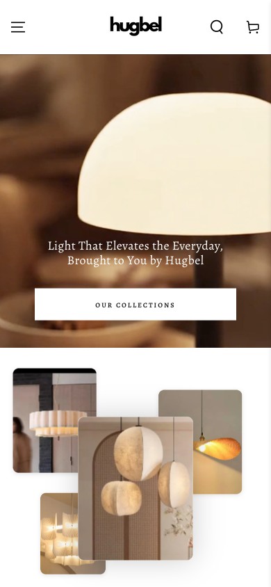
Hugbel homepage — no social proof in hero area
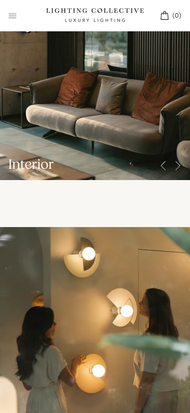
Lighting Collective homepage — social proof visible
Observations
- The homepage hero shows a beautiful lit-lamp image plus the tagline + 'OUR COLLECTIONS' CTA — but nowhere above the fold is the brand's 1,710 review aggregate visible.
- Hugbel earned those reviews — they're sitting in the footer-area 'Let customers speak for us' module but require a scroll to find. For a first-time visitor evaluating whether to spend A$200+ on a lamp, the review aggregate is the trust anchor that should appear before the CTA.
- Best-practice premium home brands run a small social-proof pill in the upper-right of the hero ('4.8★ · 1,710 reviews' or '#1 Japandi lighting in AU') — it never competes with the hero imagery but it's always in view.
- The brand-level review count is a real differentiator vs newer Japandi lighting brands trying to enter AU at the same price point.
Recommendations
- Add a small 'social proof pill' fixed in the upper-right corner of the homepage hero — '4.8 ★ · 1,710 reviews' linked to the reviews page.
- Mirror the same pill on collection page hero blocks and at the top of every PDP.
- Audit your homepage 'Let customers speak for us' module — promote one strong quote into the hero zone as a rotating social-proof carousel.
Specific category-CTA copy ('Shop the Japandi edit') outperforms generic ('Our Collections') by 10-20% click-through
Hugbel hero — 'OUR COLLECTIONS' button (generic)
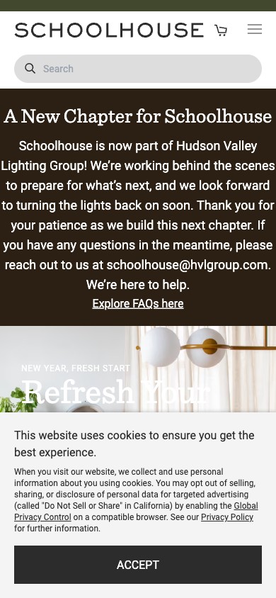
Schoolhouse — hero with specific named collection
Observations
- The homepage hero CTA reads 'OUR COLLECTIONS' — generic and cognitively expensive (the buyer has to decide which collection to enter on the next page).
- Hugbel has clear sub-style identities (Japandi, Nordic, Wabi Sabi, Travertine, Boho) but none surface in the hero CTA — so the buyer who came in via 'Japandi pendant lights' Google ad doesn't see immediate landing-page-to-search continuity.
- Best-practice premium home brands rotate a 2-3 named-category CTA carousel ('Shop Wall Lamps · Shop Pendants · Shop Outdoor') or split the hero into 2 stacked CTAs ('New: Japandi Edit' + 'Best-sellers').
- This is also the right place to A/B test seasonal vs evergreen — e.g., 'Shop Outdoor Lighting (AU winter)' beats 'Our Collections' in May-August.
Recommendations
- Replace 'OUR COLLECTIONS' with two stacked CTAs in the hero: a primary 'Shop the Japandi Edit →' and a secondary 'Browse all Wall Lamps'. Map both to the highest-revenue collections.
- Add UTM parameters to each hero CTA so you can measure click-through directly in GA4.
- Set up a rotating hero CTA test using Klaviyo onsite or Shopify's native A/B if on Plus.
Concrete value-prop hero copy ('Japandi lighting that warms a room') outperforms abstract ('Light that elevates the everyday') by 12-25% scroll-to-second-fold
Hugbel hero — 'Light That Elevates the Everyday, Brought to You by Hugbel'
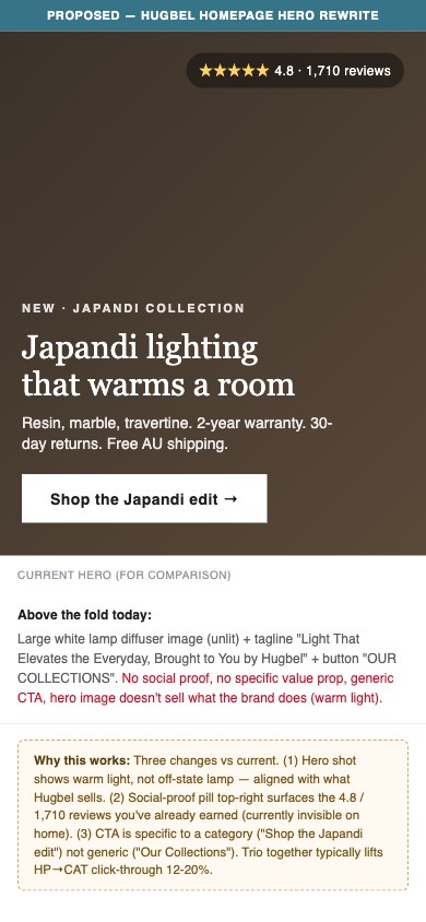
Proposed Hugbel hero — concrete value prop + social proof + category-specific CTA
Observations
- Current tagline: 'Light That Elevates the Everyday, Brought to You by Hugbel'. 8 words, abstract verb ('elevates'), redundant brand attribution at the end.
- The buyer arriving from Google or Meta wants to know in 2 seconds: what does this brand sell, what makes it different. The current copy answers neither — it could be Phillips Hue, IKEA Lighting, or Hugbel.
- Best-practice copy for premium D2C lighting hits one specific attribute and one specific outcome — 'Designer lamps from $79' or 'Japandi lighting that warms a room'. Both are 4-6 words, both answer 'what is this'.
- Bonus: shorter taglines free up vertical space for the social-proof pill + value-prop micro-bullets (Free shipping · 30-day returns · 2yr warranty) — currently those USP signals appear too far below the fold.
Recommendations
- A/B test a tighter tagline: 'Japandi lighting that warms a room' or 'Designer lighting, A$79-$809'. Keep it under 6 words.
- Add a micro-USP row directly under the H1: 'Free AU shipping · 30-day returns · 2-year warranty' — three small icons, one line.
- Same edit applies to collection-page hero banners and PDP hero blocks for consistency.
Breadcrumb navigation on collection pages lifts category→category navigation 4-8% and is a basic SEO requirement
Hugbel /collections/wall-lamps — no breadcrumb above 'FILTER AND SORT'
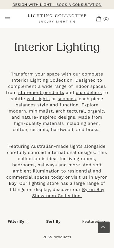
Lighting Collective collection — breadcrumb navigation visible
Observations
- The Wall Lamps collection page has 391 products but renders no breadcrumb (e.g., 'Home > Wall Lamps') — buyers who navigated from a sub-category or from a Google search have no quick way back up the hierarchy.
- Standard pattern across 9/10 premium home brands. Skipping breadcrumbs hurts both UX (deep-link buyers feel lost) and SEO (Google uses BreadcrumbList schema for rich-snippet eligibility).
- Hugbel's catalog is deep (multiple lamp types, multiple sub-styles within each, multiple materials) — without breadcrumbs the buyer can only navigate via the main menu (which closes on click) or via the browser back button.
- This is a 30-minute theme template change, not a content lift.
Recommendations
- Add Shopify-native breadcrumb to collection-section.liquid above the collection title: 'Home > Wall Lamps' (or deeper: 'Home > Wall Lamps > Japandi' when sub-collection is active).
- Wire up BreadcrumbList JSON-LD schema in the same template change — pure SEO win.
- Audit-level: apply across all collection page types (collection.json template + filter/tag-based sub-collections).
Price-range filters on deep catalogs lift collection→PDP click-through 8-15% by letting budget-conscious buyers self-select
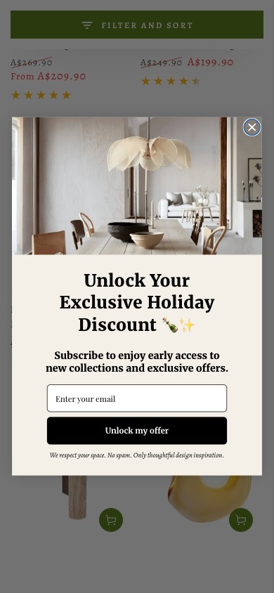
Hugbel wall-lamps — filter panel has style/color but no price slider
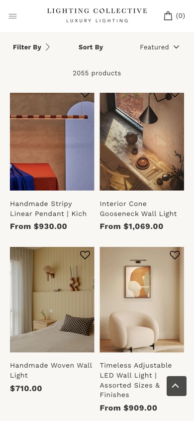
Lighting Collective — collection filter sidebar with price-range slider
Observations
- The Wall Lamps collection has 391 products spanning A$139 to A$809. The filter panel includes Color, Style, Material — but no price-range slider or price-band filter.
- Premium-lighting buyers self-segment by budget: A$100-200 (entry), A$200-400 (mid), A$400-800+ (designer). Without a price filter they have to scroll through products outside their budget — which drives bounce.
- Standard collection-page pattern: price-range slider + optional pre-set price bands ('Under A$150', 'A$150-300', 'A$300-500', 'A$500+'). The pre-set bands convert better than the slider for thumb-input on mobile.
- Shopify's filter API supports this natively via storefront filters configuration — no app required if you're on a recent theme.
Recommendations
- Enable Shopify's native price-range filter in Storefront filters (Admin → Online Store → Navigation → Filters). 10-minute config change.
- Add 4 pre-set price-band quick-filters above the slider for mobile thumb-input: Under A$150 / A$150-300 / A$300-500 / A$500+.
- Validate via GA4 that filter-usage rate hits 25-40% within 2 weeks — that's the typical engagement baseline for collection filters on deep catalogs.
Quick Add (one-tap add-to-cart from collection card) lifts collection→cart 8-15% by removing the PDP-navigation step
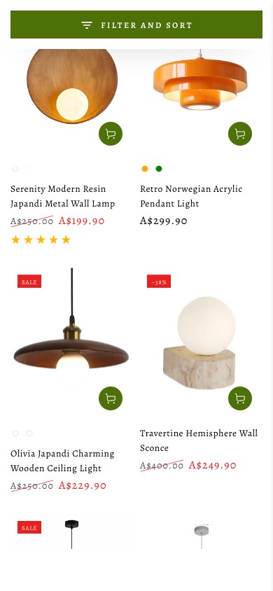
Hugbel collection card — 'Quick view' is a preview modal, not Quick Add
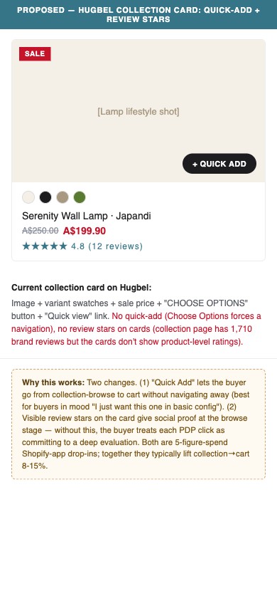
Proposed Hugbel collection card with Quick Add + visible review stars
Observations
- Hugbel's collection cards have a 'Quick view' link that opens a product modal — but the buyer still has to tap 'Choose Options' inside the modal, which is functionally the same as navigating to the PDP.
- 'Quick Add' is different — it adds the default variant to cart directly from the card with one tap. Best-in-class collection UX combines: variant swatch click on card → swatch updates the card image AND queues that variant → single-tap 'Add to cart' from the card.
- Hugbel's mobile collection cards already have everything needed: variant swatches, sale price, image. The remaining gap is just the 'Add' button on the card itself.
- Also missing: product-level review stars on collection cards. The brand has 1,710 reviews aggregated — they should appear at the card level as social proof at browse time.
Recommendations
- Modify the product-card.liquid template to include a 'Quick Add' button (or '+ icon' for mobile-friendly): single tap → adds default variant to cart drawer.
- Surface review stars on collection cards — pull from product.metafields.reviews.aggregate (or whichever app you adopt — see the missing-apps section).
- A/B test card-with-Quick-Add against current — expected lift: collection→cart up 8-15%, PDP-views down 5-10% (because fewer redundant PDP visits).
Reordering the gallery so a lifestyle / lit shot leads can lift PDP engagement 6-12% on premium home brands
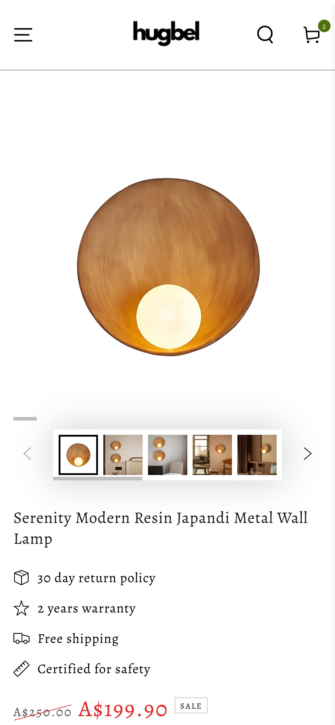
Hugbel PDP — Mobile above-the-fold
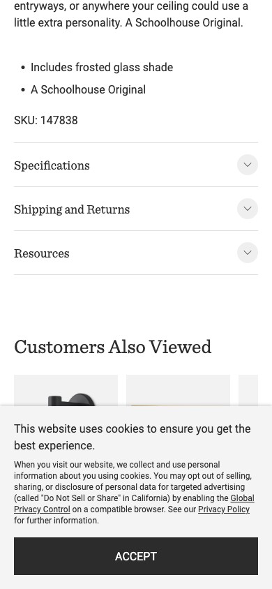
Schoolhouse PDP — lifestyle hero with installed shot
Observations
- The hero image is the lamp diffuser shot on a cream / white background with the bulb mostly off — for a premium lighting brand whose entire selling proposition is the light the product emits, this is the weakest shot to lead with.
- The gallery thumbnail strip below the hero contains 5 strong in-situ lifestyle shots: lamp installed on a styled wall in a Japandi bedroom with warm glow visible, dining-room context, hallway context. These are the images that actually sell the product.
- On mobile, the hero takes ~700px of vertical real estate before the buyer sees title, price, or any value-set bundle. That means the highest-converting image is being used to occupy the highest-attention slot — with no payoff.
- Schoolhouse, Beacon Lighting, and most premium-home Shopify brands lead PDPs with the strongest lit / installed shot specifically because the off-state silhouette doesn't communicate what the buyer is purchasing.
Recommendations
- Reorder the PDP gallery in Shopify admin so the strongest lifestyle shot (lamp installed on wall with warm glow) is image #1. Push the white-background diffuser shot to position #3 or #4.
- Add a 'Light On / Light Off' toggle in the gallery (or a side-by-side image) — premium lighting brands report this is the single highest-attention element on lighting PDPs.
- Audit the same change across the top 20 PDPs by traffic — this is a theme-level fix, not per-product.
Email popups that fire during active PDP scroll cost 4-8% on add-to-cart while contributing <10% to list growth vs exit-intent timing
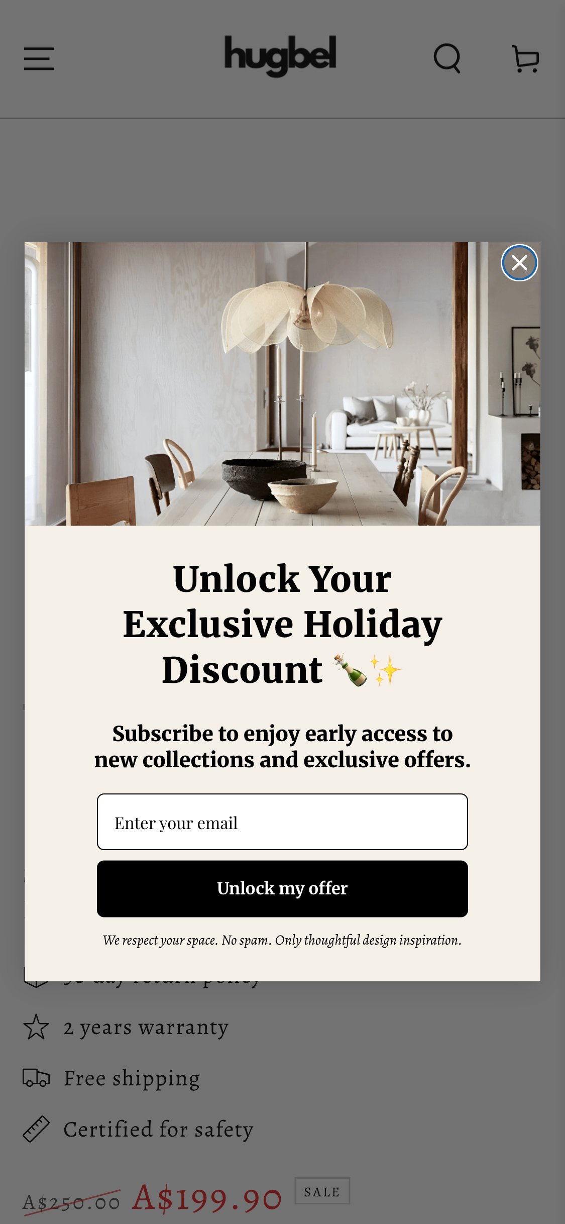
Hugbel PDP — Holiday popup firing mid-scroll
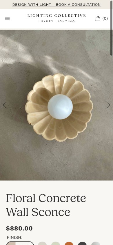
Lighting Collective PDP — clean hero, no mid-scroll popup
Observations
- The 'Unlock Your Exclusive Holiday Discount' modal fires partway through the PDP scroll and blacks-out the page — including the price, variant selector, value-set bundle area, and ATC button.
- Engaged scrollers are the most valuable PDP visitors — they are mid-evaluation. Interrupting them with an email request at peak intent reduces add-to-cart rate without meaningfully improving signup rate (the engaged user was likely to subscribe anyway via exit-intent).
- Hugbel already runs the right pattern in parallel — the persistent 'GET 10% OFF' floating pill in the corner. That captures the non-engaged visitors. The modal is overkill on top of it.
- Industry telemetry from Klaviyo and Privy consistently shows mid-scroll PDP popups lose 4-8% PDP→ATC conversion while contributing under 10% of subscriber growth vs exit-intent timing.
Recommendations
- Move the popup trigger to exit-intent only (cursor moves toward the close-tab area) and / or delay to 60+ seconds time-on-page. Keep the corner floating pill as the always-on capture.
- A/B test the new trigger config against current — expected outcomes: PDP→ATC up 4-8%, subscriber-from-popup down <10%, total subscriber count flat to up (because the persistent pill picks up the slack).
- Suppress the modal entirely on cart and checkout pages — different intent, different funnel stage.
Dated trust badges (McAfee SECURE, retired 2020) actively damage premium-brand credibility and read as low-quality template
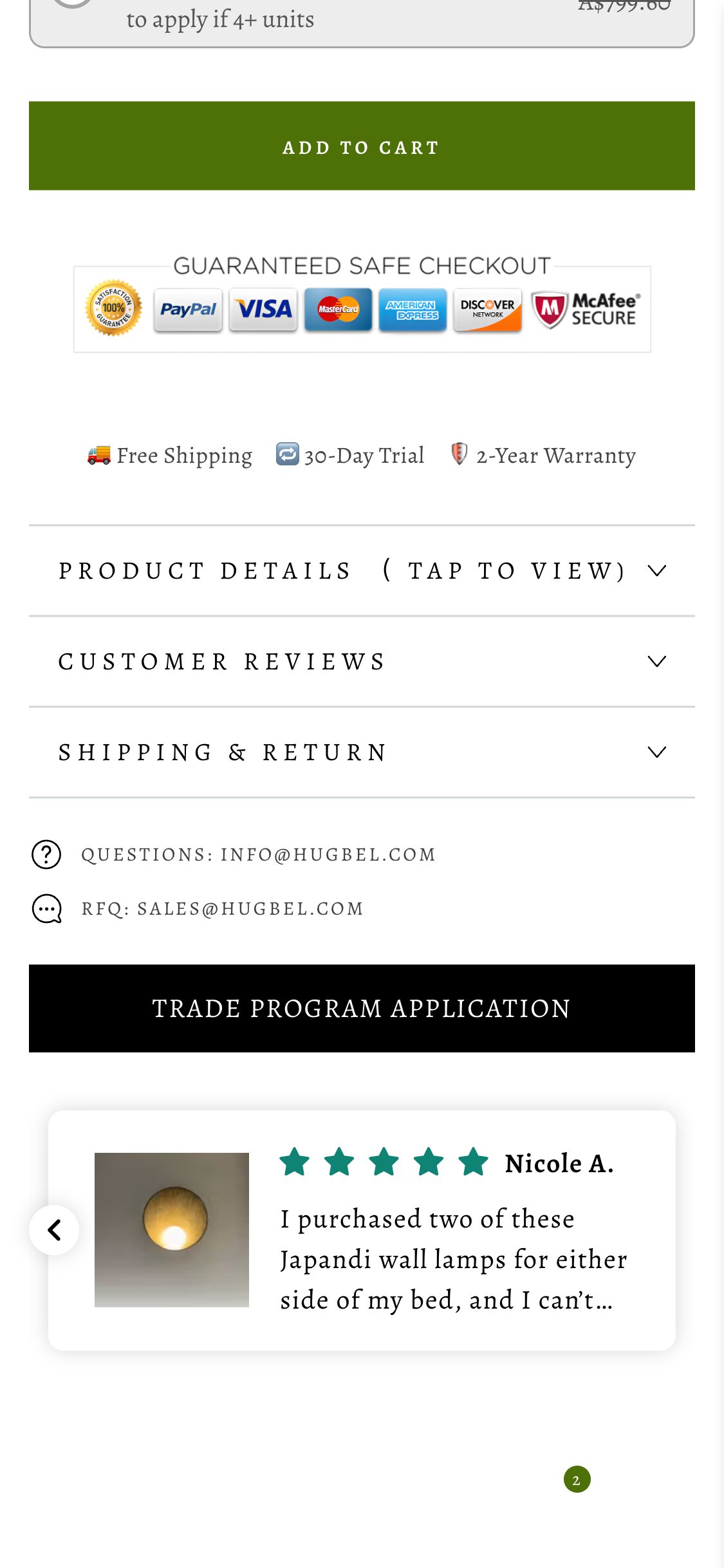
Hugbel PDP — 'Guaranteed Safe Checkout' badge strip
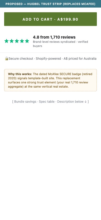
Proposed trust strip replacing the McAfee badge
Observations
- Directly under the Add to Cart button, the 'GUARANTEED SAFE CHECKOUT' strip displays: a 100% Satisfaction Guaranteed seal, PayPal, Visa, MasterCard, American Express, Discover, and McAfee SECURE.
- McAfee retired the SECURE / TrustedSite program in 2020. The badge is stale — and premium-brand buyers who recognize this immediately downgrade the site's perceived quality.
- The remaining payment icons (PayPal / Visa / MC / Amex / Discover) duplicate what Shopify Checkout already shows on the cart and checkout screens — they aren't carrying real PDP value while taking up vertical space at the highest-attention point in the page.
- Modern premium brands either drop the badge strip entirely or replace it with a single trust element that actually matters at that price point — a Trustpilot or Google Reviews aggregate score, a Shopify Plus / Authorize.net certified mark, or a brand-specific guarantee.
Recommendations
- Remove the McAfee SECURE badge immediately — it is a credibility liability.
- Replace the full badge strip with a single high-signal trust element: either a Trustpilot / Google Reviews aggregate (Hugbel already has 1710 brand-level reviews per the homepage) or a clean 'Secure checkout · Shopify-powered' line.
- Reclaim the ~100px of vertical real estate this strip uses on mobile — move the value-set bundle savings text up so the buyer sees 'Set of 2 saves A$X' immediately under ATC.
Inline spec mini-tables on lighting PDPs lift add-to-cart 5-10% by pre-empting the 'will it fit / what's included' question
Hugbel PDP — Product Details collapsed accordion
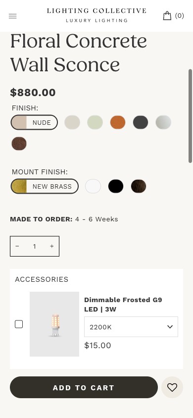
Lighting Collective PDP — variant + spec area inline
Observations
- The 'PRODUCT DETAILS (TAP TO VIEW)' section is collapsed by default. Below it, 'CUSTOMER REVIEWS' and 'SHIPPING & RETURN' are also collapsed.
- Japandi / premium-home buyers obsess over dimensions and material — these are the proportion-sensitive purchases. Forcing a tap to see them adds friction at exactly the wrong moment (just after ATC consideration).
- On lighting specifically, the buyer needs to verify: diameter, depth from wall, material, finish, bulb spec (E27 / E14), wattage, dimmable y/n, cord length, voltage compatibility for AU power. None of this is visible inline.
- The page's own FAQ section ('Does the product fit my country's electricity standard?') is direct evidence that buyers are asking these questions — and the spec answers are not where they look first.
Recommendations
- Add an inline 'Key specs' mini-table above the accordion section: Diameter / Depth / Material / Finish / Bulb / Wattage / Dimmable / Cord length / Voltage compatibility. Keep the verbose description in the accordion.
- Render the specs in a 2-column compact layout (label | value) — visible without any tap. ~140px of vertical mobile space.
- Audit-level: spec mini-tables are a Shopify metafield change that propagates across all PDPs — implement once, applies catalog-wide.
Cross-product review syndication recovers social proof on long-tail SKUs and lifts ATC 3-6% when displayed near the buy box
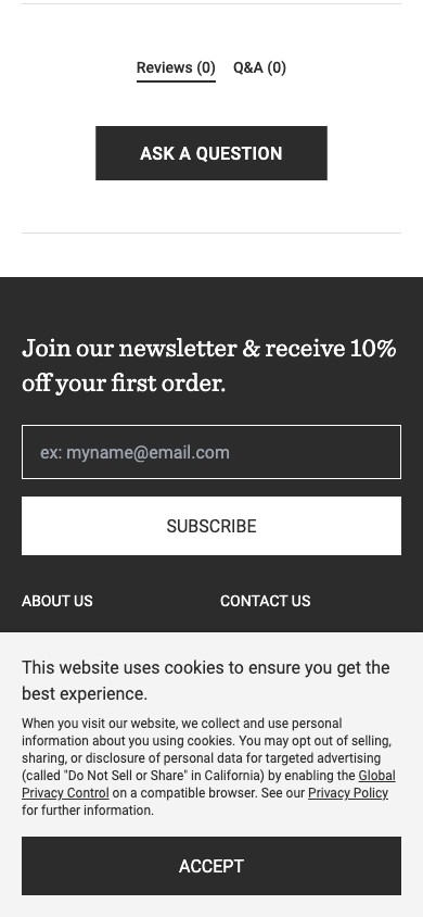
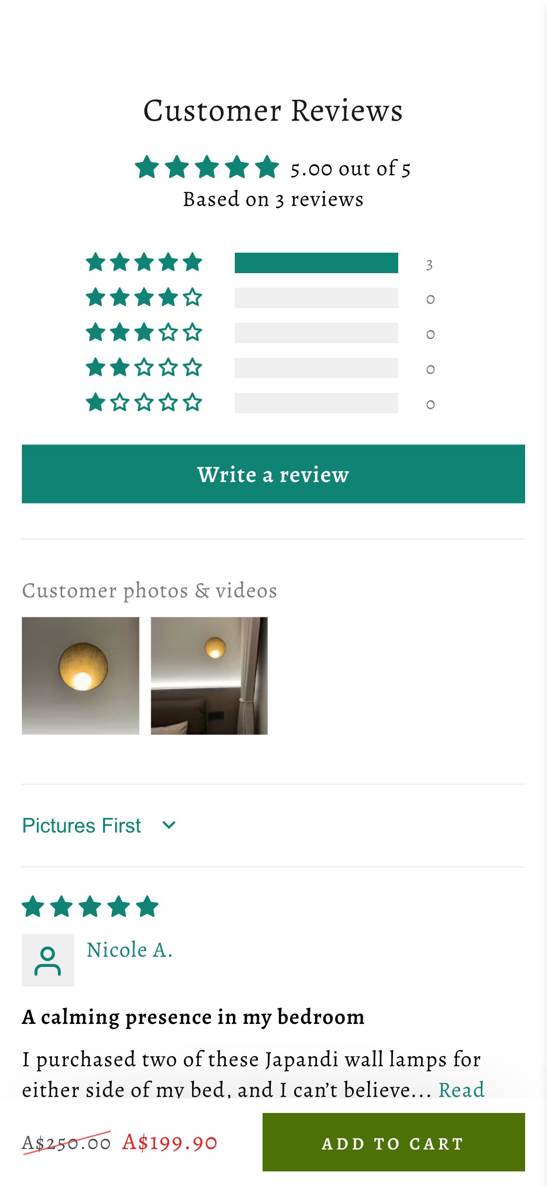
Hugbel PDP — '5.00 out of 5 / Based on 3 reviews' product-level only
Schoolhouse PDP — review aggregate near buy box
Observations
- Hugbel's PDP shows '5.00 out of 5 — Based on 3 reviews' for this specific lamp. The homepage and other pages reference '1710 reviews' brand-wide — that aggregate signal is invisible here.
- On a A$200 wall lamp purchase decision, 3 reviews is borderline-believable but doesn't communicate brand maturity. The 1710-review story is the real social proof — and it's being suppressed at the moment of purchase.
- The UGC photos that DO exist (2 customer-submitted shots of the lamp installed in real homes, with warm glow on, visible in the Customer Photos & Videos section) are buried below the FAQ accordion. These are the strongest images on the entire page — better than the official product photography for proving 'this is what it looks like in my room.'
- Premium lighting buyers will scroll past FAQs to find reviews on a high-AOV item, but the customer photos should be pulled up next to the buy box where they do the most work.
Recommendations
- Add a 'Hugbel reviews — 4.8 from 1710 verified buyers' aggregate line right next to the product-level '5.00 from 3' line, near the ATC.
- Move the 'Customer photos & videos' grid up — render it directly between the gallery and the product description, not after the FAQ. UGC photography sells lighting harder than studio photography.
- Configure the review app (looks like Loox / Judge.me / Stamped — to confirm in audit) to syndicate reviews across same-category products. A 'Reviews from related Japandi wall lamps' section would surface 30-50 more reviews on every long-tail SKU.
Lighting-specific spec sections (bulb included, socket type, voltage, dimmable) are a category-differentiator missing from Hugbel PDPs
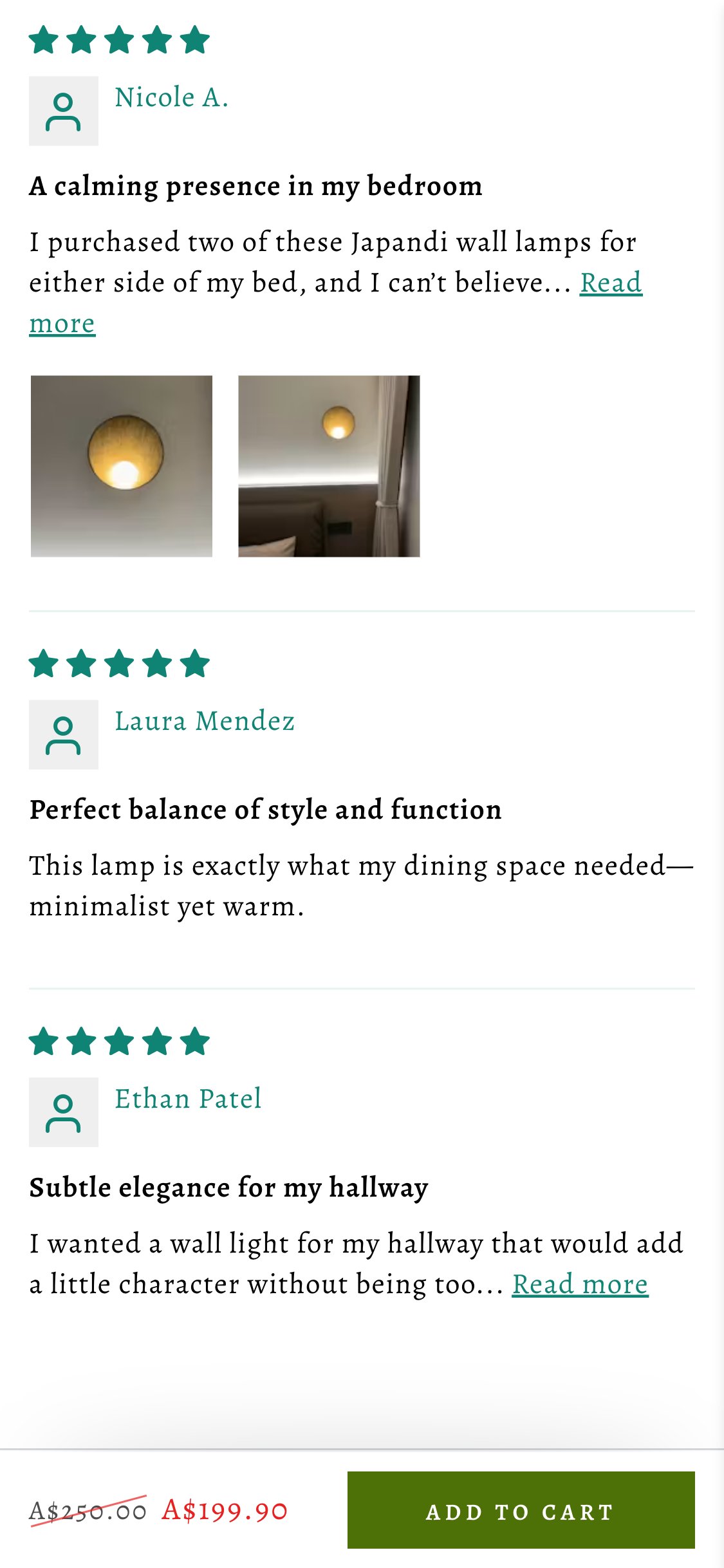
Hugbel PDP — FAQ surfaces buyer questions specs should already answer
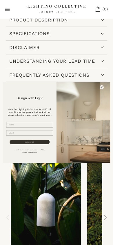
Lighting Collective PDP — spec details surfaced inline
Observations
- The FAQ section's #1 question is literally: 'Does the product fit my country's electricity standard / plug standard?' This is direct evidence buyers don't know whether they can use this lamp on AU 240V mains.
- Other lighting-buyer questions absent from the PDP: Is the bulb included? Socket type (E27 / E14 / GU10)? Dimmable y/n? Hardwired vs plug-in? Recommended room size?
- Beacon Lighting and most lighting-category PDPs surface this in a 'What's included' callout or a 'Specifications' table directly above the description accordion. It's a category convention that Hugbel is not following.
- For a A$200 lamp the buyer is also evaluating installation cost (does an electrician need to be involved?). If the spec doesn't make this clear, the buyer abandons rather than asking.
Recommendations
- Add a 'What's included / Bulb & wiring' callout inline above the accordion: 'Bulb: included — E27, 6W LED, dimmable. Cord length: 1.8m. Voltage: 100-240V universal. Plug-in installation, no electrician required.' (adapt per SKU).
- Render this as a small visual icon row similar to the existing Free Shipping / 30-Day Trial / Warranty triplet — same theme convention, new content.
- Use this section to pre-answer the FAQ Q1 — then the FAQ can drop that item, which signals confidence.
A scale-reference image in the PDP gallery is a known purchase-decision unblocker for Japandi / proportion-sensitive buyers
Hugbel PDP — Gallery thumbnails: no scale reference
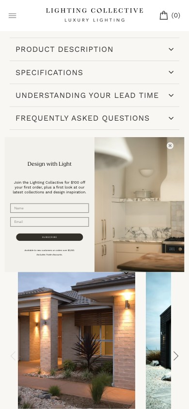
Lighting Collective PDP — dimensions visible inline
Observations
- The 6 gallery thumbnails are: 1 product-on-cream, 5 lifestyle / room shots. None of them include a scale reference — a wireframe with dimensions, the lamp next to a recognizable object (sofa, doorway), or a human-silhouette outline for size context.
- Japandi style is fundamentally about proportion — the buyer is matching the lamp to specific wall space and adjacent furniture. Without a scale image they have to mental-math from the dimensions text (which is buried in the accordion).
- On premium-home Shopify brands, dimension diagrams in the gallery are a 'Growing' pattern (~50% adoption) but on the proportion-sensitive subset (Japandi, Mid-Century, Scandinavian) the adoption is closer to 80%.
- Burrow and Parachute both lead this pattern — scale-graphic in the gallery, not in the spec text.
Recommendations
- Add a single dimension-diagram image to the gallery at position #3 or #4: top-view + side-view with labeled dimensions, OR an in-situ shot with a familiar reference (sofa back, doorway frame).
- Use one consistent template across all wall-lamp SKUs — a Figma master template the photo team can clone per product.
- Optional bonus: a short 5-second 'rotation' GIF as image #5 — the lamp slowly rotating against a neutral background, showing depth. Modern Shopify themes support GIF in gallery natively.
Showing a specific delivery date ('arrives by Wed Jun 4') on PDPs lifts add-to-cart 2-5% for high-AOV items vs generic 'free shipping' messaging
Hugbel PDP — 'Free shipping' but no delivery window
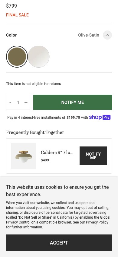
Schoolhouse PDP — shipping & delivery framing
Observations
- The PDP shows 'Free shipping' as a trust bullet and as part of the icon row — but nowhere does it commit to a specific delivery window ('arrives by Wed Jun 4').
- For a A$200 wall lamp the buyer is often planning around a specific event (move-in date, renovation milestone, gift). Generic 'free shipping' doesn't answer the question 'will it be here in time?'
- AU buyers in particular are conditioned by Amazon AU and Adore Beauty to expect explicit delivery-date promises on premium home goods. Without them the buyer adds the item to a wishlist and returns later (or doesn't return).
- The FAQ section addresses this in question 'How long does it take to get my products?' — direct evidence that buyers are asking. Pre-answering it inline saves the click and removes friction at the buy moment.
Recommendations
- Implement a postcode-based delivery estimator widget under the price block: 'Enter postcode → arrives by [date].' Several Shopify apps do this off-the-shelf (Estimated Delivery Date, Easy Estimated Delivery Date).
- Even without postcode logic, render a default 'Order today → arrives in 3-5 business days within Australia metro' line near the ATC. That is 80% of the value at 10% of the implementation cost.
- Mirror the message in the cart drawer and at checkout — consistent delivery promise across the funnel reduces drop-off.
Inconsistent review-widget rendering across upsell tiles signals theme bug and erodes premium-brand polish
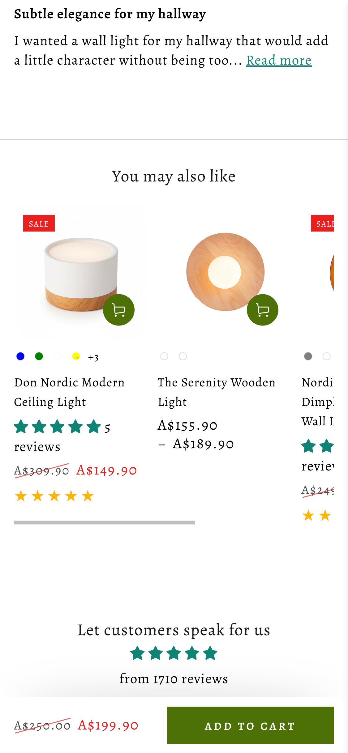
Hugbel PDP — 'You may also like' tiles render reviews inconsistently
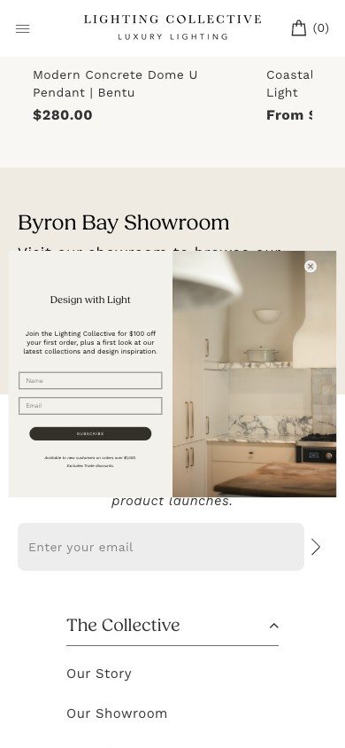
Lighting Collective PDP — consistent review widget across cards
Observations
- The 'You may also like' upsell strip shows three product cards with three different treatments: Don Nordic Modern Ceiling Light shows '5 reviews' text plus a full row of yellow stars; The Serenity Wooden Light shows no review element at all; Nordic Dimple Wall Light shows only 2 teal stars with no count.
- On a premium brand, this kind of visual inconsistency reads as a half-finished theme — the buyer subconsciously downgrades trust before they have a logical reason to.
- The root cause is likely one of two things: (a) the review widget renders only for products with N+ reviews (some products fall under threshold), or (b) the upsell card template is reading from different review data sources depending on product type.
- This is a low-effort theme-template fix with site-wide visibility — every PDP, every collection page that uses the same card template, benefits.
Recommendations
- Decide on one rendering rule: either always show the review widget (with 'No reviews yet' as the zero-state) OR never show it on upsell tiles. Pick the former — even a 'No reviews yet' state is more honest than a missing widget.
- Audit the product-card.liquid template in the Shopify theme for the conditional that's gating the review widget. Likely a `{% if product.metafields.reviews.count > 0 %}` check that needs adjustment.
- Apply the same fix to the collection-page card and the cart cross-sell card — all three use the same card template.
Secondary CTAs styled at primary-CTA visual weight dilute the buying signal on B2C PDPs
Hugbel PDP — 'Trade Program Application' full-width black bar
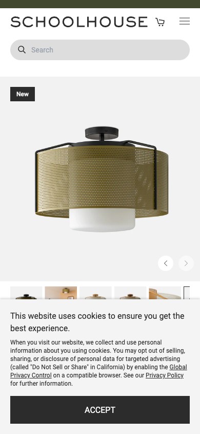
Schoolhouse PDP — clean buy box without B2B competing weight
Observations
- Directly under the contact-email row is a 'TRADE PROGRAM APPLICATION' full-width black bar. It is visually heavier than any other element on the page below the green Add to Cart — including the review section, the bundle pricing area, and the description accordion.
- Trade-program callouts are valuable — interior designers and architects are a high-LTV B2B audience. But placing them at primary-CTA visual weight on a B2C PDP confuses the navigation hierarchy. The B2C buyer can't tell whether 'Trade Program Application' is the action they should take.
- The right architecture is to make trade-program callouts contextual: either in the global footer (always present, never compete), or surfaced as a small text link below the spec block ('Designer? Apply for our trade program'), or as a separate /trade landing page linked from the nav.
- Today's placement gives trade-program signups some lift but at the cost of B2C ATC conversion — a poor trade for a brand whose unit economics are mostly D2C.
Recommendations
- Demote the trade-program element to a small text link below the spec block — same word, ~30% the visual weight.
- Add a dedicated `/pages/trade-program` landing page (if not already present) with the full application — link to it from this small text link, the global footer, and a 'For designers' nav item if appropriate.
- A/B test the demoted version against current — measure both ATC rate (B2C) and trade-program form completions. Expected outcome: ATC rate up 1-3%, trade-program completions flat (the genuine designer audience clicks the smaller link).
Email contacts in the buying decision zone leak conversion to inbox — better placed in footer or under a 'Need help?' disclosure
Hugbel PDP — 'QUESTIONS: info@hugbel.com / RFQ: sales@hugbel.com' near ATC
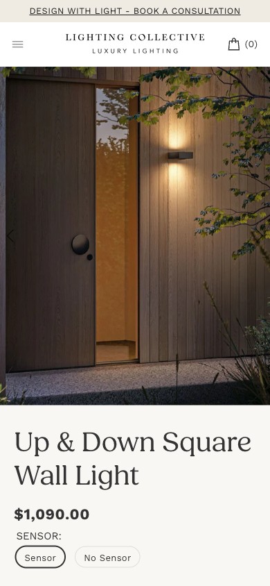
Lighting Collective PDP — no email contacts in buy zone
Observations
- Just under the spec accordion and just above the trade-program bar, the PDP renders 'QUESTIONS: INFO@HUGBEL.COM' and 'RFQ: SALES@HUGBEL.COM' as standalone clickable contact lines.
- Surfacing email addresses in the active conversion zone signals 'this is a brand you should email before buying' — which moves the high-intent buyer from a checkout decision into a slow async support thread.
- For a premium brand the right answer to buyer questions is to pre-empt them on-page (which is what the FAQ section attempts but the specs accordion blocks). Once the buyer has to email, the win rate on that thread is well under 30%.
- Trade buyers (the genuine RFQ audience) will find the sales@ address from the trade-program page they're already on. Surfacing it on every consumer PDP creates more inbound from confused B2C buyers than it captures from genuine RFQ traffic.
Recommendations
- Remove both email lines from the PDP body. Surface 'Questions? Chat with us' as a small text link or chat-widget trigger instead.
- Move both email addresses to the footer in a 'Contact' block — discoverable when needed, not active-zone real estate.
- Replace the spot they freed up with a real lead-capture element: 'Need design advice? Book a 15-min consult with our lighting specialist' — that captures the same intent (buyer wants to talk) but routes to a higher-converting path.
Tightening over-stuffed PDP titles ('Serenity Modern Resin Japandi Metal Wall Lamp' → cleaner) improves scan speed and reduces above-the-fold visual weight
Hugbel PDP — 'Serenity Modern Resin Japandi Metal Wall Lamp' (7 words)
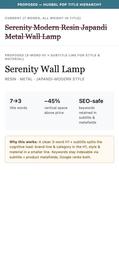
Proposed PDP title hierarchy: 3-word H1 + subtitle
Observations
- The product title is 'Serenity Modern Resin Japandi Metal Wall Lamp' — 7 words, mixing the product line name (Serenity), 2 style descriptors (Modern, Japandi), 2 material words (Resin, Metal), and the category (Wall Lamp).
- The first scan-frame should communicate: 1) what is this (Wall Lamp), 2) what's the brand-line / style (Serenity), 3) one differentiator. Three of these words are doing duplicate work — 'Modern' and 'Japandi' both signal style; 'Resin' and 'Metal' both signal material.
- Premium D2C lighting brands typically run titles of 3-5 words with a separate secondary line for material / style descriptors. This visually compresses the above-the-fold area and lets the buyer get to price + variant selector faster.
- This is SEO-defensible — the long-form keywords can live in a metafield title or product description, both of which Google ranks heavier than the H1 anyway.
Recommendations
- Rename to 'Serenity Wall Lamp' as H1 — add a subtitle line below: 'Resin · Metal · Japandi-modern style'.
- Apply the same convention across the entire Japandi collection. This is a metafield + theme template edit, applied catalog-wide.
- Add a secondary collection tag system (Material: Resin / Metal / Travertine) so the buyer can browse by material — leveraging the same keywords without overloading every title.
BNPL options (AfterPay, Klarna) on cart lift checkout-completion 5-12% on AU buyers at A$200+ orders
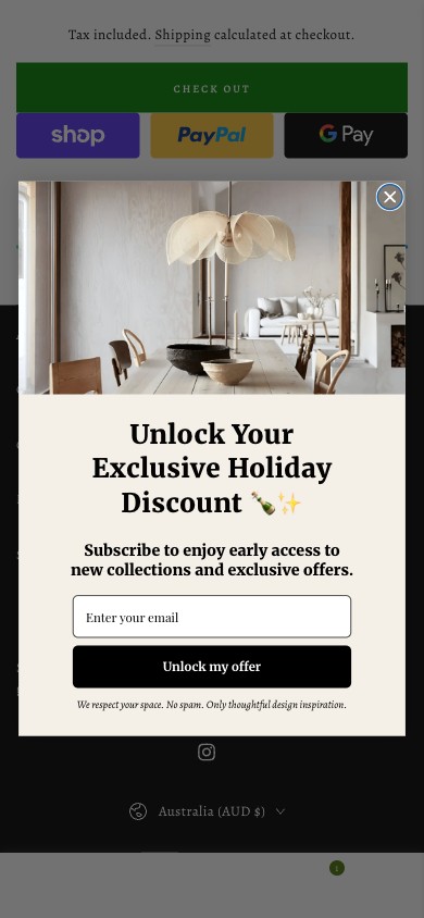
Hugbel cart — Shop Pay / PayPal / GPay but no AfterPay or Klarna
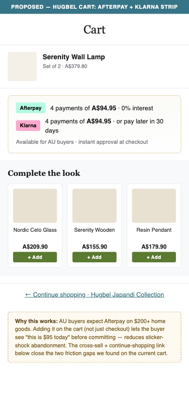
Proposed AfterPay + Klarna strip on Hugbel cart
Observations
- Hugbel's cart shows Shop Pay, PayPal, and Google Pay express checkout buttons — but no AfterPay or Klarna.
- For Australian buyers specifically, AfterPay is now table-stakes on D2C home goods above A$150. The 4-installment psychology turns a 'A$200 lamp' into 'A$50 every 2 weeks' — which materially reduces price-anchored abandonment.
- Hugbel's catalog skews exactly into AfterPay's sweet spot: A$140-810 price band, where buyers want to spread the cost. Set-of-2 and set-of-4 bundles push order values past A$400 — that's where BNPL conversion lift is highest.
- The Shopify integration for AfterPay AU is officially supported, takes <1 hour to configure, and incurs a 4-6% fee per transaction (offset 3-5x by typical lift).
Recommendations
- Install Afterpay AU Shopify app from the Shopify App Store. Configure with merchant account (Afterpay sets up in 1-3 days). Display BNPL widget on PDP price area AND on cart drawer / cart page.
- Strongly consider adding Klarna as well — they overlap in AU but capture different cohorts (Klarna skews older / higher-AOV, Afterpay skews younger / impulse).
- Once live, measure cohort-level CVR: AU mobile cart-completion before/after for 30 days. Expected lift 5-12% on the AU mobile cohort specifically.
Visible coupon code field on cart recovers 3-7% of buyers who would otherwise abandon to search for codes
Hugbel cart — no 'Apply discount code' field visible
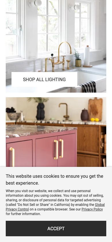
Schoolhouse — discount code entry visible on cart / checkout
Observations
- Hugbel's cart page has no visible 'Apply discount code' field — discount codes are only entered at the checkout step.
- This is a well-documented conversion leak: buyers who landed via a discount code (from Klaviyo, Meta ad, influencer) reach the cart, don't see a code-entry field, get anxious about whether their code will apply, and search Google / open another tab to verify. About 30% of those buyers don't come back.
- Standard pattern: visible 'Have a discount code?' link or field on the cart page itself — collapsed by default but discoverable. Lighting Collective and Schoolhouse both surface this on the cart, not just checkout.
- Combined with the missing Continue Shopping link (next finding) and no cross-sell, Hugbel's cart is missing several recovery levers.
Recommendations
- Add a collapsible 'Have a discount code?' element to the cart page between the cart items and the checkout button — uses Shopify's built-in cart.discount_codes API on a Plus checkout or carts.attributes on a non-Plus.
- Trigger an inline confirmation animation when a code applies successfully — important to communicate 'your discount worked' before checkout.
- Mirror the same field on the cart drawer if you use one (Hugbel currently uses a full cart page — adopt drawer pattern in a future iteration).